Saturday, 28 January 2017
Friday, 27 January 2017
'XXL' Magazine Analysis
Front Page
The colours that the music artists are wearing are gold, purple, red, these are all rich colours. Gold has connotations of illumination and loyalty. Purple has connotations of royalty, nobility, luxury, power, and ambition. Red/burgundy is associated with strength, power, determination as well as passion. From the colours they are wearing we know they are very wealthy. They are also wearing many big chains around their neck which is also a sign of wealth. Both of the males 'Young Thug' and 'Gucci Mane' have tattoos all over their body, tattoos are stereotyped with young Afro-Caribbean males who are associated with drugs and gangs, however on this front cover they are seen as wealthy young males and not gangsters which is a countertype. The man of the left 'Young Thug' is covering the masthead which is connotation of magazines.
There are not many cover stories and they are all listed at the top right hand corner of the magazine which is strange in a magazine as a connotation is to have the cover stories all around the CVI.
The main story is at the bottom of the front cover and it is bigger than the cover stories which is also a convention of magazines.
Sunday, 22 January 2017
'Uncut' Magazine Analysis
Front Page
The masthead of this magazine is 'Uncut', it is conventional as it is at top centre of the magazine. There is a picture boost of Leonard Cohen, we know this as the main article is about him, there is also a pull quote from the article on the front page to draw people in. There are many other headlines around the picture boost. The colour scheme of the front page to this magazine is red, white and black, however it is not used throughout the magazine which breaks the conventions. There is a barcode in the bottom right hand corner of the magazine which is a convention of magazines. The magazine also comes with a free CD which is for promotion as more people are likely to buy the magazine as they receive free things such as CD's.
Contents Page
The contents page doesn't follow the connotations of a normal music magazine.
Double Page Spread
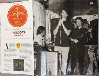
The double page spread includes facing pages to show that the article links to the picture.
Saturday, 21 January 2017
'Q' Magazine Analysis
Front Page
The masthead of this magazine is 'Q', it is a convention as it is at the top of the page however it is not centered like most mastheads. There is a picture boost of Pete Doherty, we know this as the main article is about him. There are many other headlines which fill up the front page to make the magazine look like it is packed with a lot of content. The colour scheme of this magazine is red, white and black, which is also used continuously throughout the magazine. There is a barcode in the bottom right hand corner of the magazine which is a convention of magazines. The magazine comes with a free CD which is for promotion as more people might want to buy the magazine because of the CD.
Contents Page
The contents page is organised as there are articles with the page numbers next to it. The contents page is conventional as it includes pictures that relate to the articles. The colour scheme is still continued through to the contents page.
Double Page Spread
The double page spread includes facing pages to show that the article relates to the picture. The colour scheme is still continued through to the double page spread. There is a drop capital at the beginning of the article to indicate where it starts.
Wednesday, 18 January 2017
I marked work from a previous Media A Level student who posted their work through blogger using this mark scheme.
For their research and planning their overall score out of 20 was 10 which is a level 2, as their research and planning was basic/partially incomplete.
For their construction their overall score out of 60 was 33 which is also a level 2, as their construction was basic.

For their evaluation their overall score out of 20 was 9 which is a level 2, as their evaluation was basic.
Subscribe to:
Comments (Atom)


